
 Careers
Best Practices For Call-To-Action Button Design To Enhance User-Experience
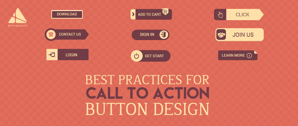
While User interaction is designed, various significant aspects are often overlooked. A CTA is that black and white area that grants clarity. Call to action buttons are a tool of communication between the user and the system. In the world of e-commerce and/or m-commerce, a CTA button is more than a tool for capturing attention. It is rather an inevitable part of the user journey. The most commonly used call-to-action buttons have the following purposes.
Add to cart
Free trial sign-up
Download
The virtual click affects provided in the CTA button is guided with visual sign. Often the consideration for CTA button design has to be the right mix of art and science. If you get that right, you will get more clicks and conversions. Here’s a small run-down of design tips to lead user to checkout or any other intended action.
CTA Button size should be proportionate
Well, bigger button draw attention and are mobile-friendly but avoid overdoing it. The idea is to provide a smooth user experience by increasing the clickable area. Also, the text within that button should be readable and centrally aligned. A finger-friendly button is most desirable if you want to design it mobile audience. It is also safe to make the CTA 20% bigger than the logo.

Go for rounded edges
Notice the various apps and websites, and you will see most of them use a square button with rounded edges. The logic for this decision can be traced in visual psychology. Rounded corners are believed to attract people’s attention to the center whereas square edges draw people’s attention away from the center. A word of caution though for people who would like to experiment and choose outrageous shapes.

Label Call-to-Action Buttons accurately
The last you want is to trap the user in a rut of ambiguity. If the user has doubts about clicking, then perhaps you haven’t clarified the message. Ideally, it should state the obvious because generic or misleading labels happen to be one of the top reasons for cart abandonment. Imagine that you accidentally triggered a delete action and now you see the following error message.

It’s a crucial situation where you have no idea what ‘OK’ or ‘cancel’ represent.
Leave Ample Whitespace
Too much text or images around a CTA button would also distract the user. In order to make the message on the Call-to-action button stand out, it is important to leave some negative space. To add more drama, you can guide to the button by placing arrows pointing towards it. Here’s an example to elucidate the idea.

Latest posts by Moiz Khan (see all)
- How to Use AI to Enhance your SEO Strategies? - August 31, 2023
- What You Need to Know About Test Automation in DevOps - August 30, 2023
- 6 Cloud Computing Challenges That Businesses Need to Be Aware of - August 22, 2023


