
 Careers
Web Design Mistakes to Avoid That Affect Website Conversion Rate

It’s important to realize that there are some website design elements that can greatly reduce your conversion rate. Conversion is the method of converting from one form to another. In the case of marketing, it’s turning visitors into customers. Conversion is a phrase used to often define the act of converting a customer who browses your site – into a paying customer. Here are some of the most common website conversion mistakes—and the solutions to fix them.
Messy Layout
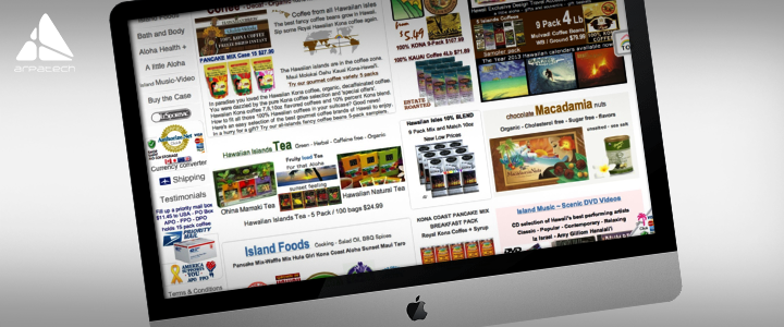
Websites that are chaotic are frustrating to users. When one web page comprises of too many items, they all strive for the interest of a user and add difficulty in the way of a customer’s decision. The user can overlook your CTA or a major deal, not knowing where and when to look, resulting in fewer conversions. If your web design is cluttered, the visitors tend to spend their time looking for what they came for (which they don’t always know) unless they get overwhelmed and irritated. They quit without making a purchase, and they never return in most instances. To avid that, therefore, you should not clutter your website. Only the main image, primary headline, CTA, a concise list of product or service benefits and some social evidence to add credibility to your claims are the items you can use on your landing page.
Moreover, include some white space between descriptions, images, forms and CTAs for effective product pages. In your design aesthetic, do not use more than three shades and restrict yourself to just one or two fonts. The key is to think first about usability and then about aesthetics.
Use of Stock Images
Images are a vital part of website design and visual media are synonymous with modern audiences. You have probably heard it so many times that more engagement is driven by visual content. If you want to stay up to the mark with visuals, use meaningful, high quality and authentic images. Doing so can drive you more engagement and conversion.
Your credibility is compromised by the use of stock images. Never use the generic stock photos as they can give the audience the wrong message. Any image you are using on your website must have an objective such as pushing visitors towards the conversion goal. So, be sure that you use only real, high-quality and relevant images on your website.
Unavailability of Responsive Website Design
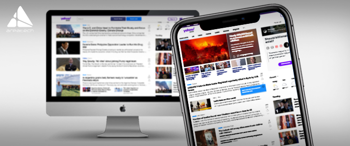
According to Statista, a staggering 3.8 million people worldwide have been using their mobile devices to go online. When people fail to use your website’s best features on their phones, they tend to move on to one that allows them to do it. Visitors to your website are looking for a full site experience, and not just an adjusted version. Most people use smartphones, tablets to shop online and perform different activities. Therefore, it is vital that your website adjusts designs as per the screen size of the users and get an opportunity not to lose the conversion rates. Doing so will move you a step closer to conversions.
Unimpressive Content
The content quality on your landing pages must be unique together with pleasant images that have an adverse effect on your visitors. The content should therefore be written with a clear vision that is simple for customers to comprehend and help them with what they are looking for.
In particular, eCommerce website descriptions are mostly boring and have the monotonous context. Keep the description of your products unique with catchy language. The content serves an important part in attracting the attention of your customer when they visit your site. Therefore, you need quality and genuine content to get a high conversion rate.
Unclear Navigation
Irrespective of how visually impressive your site is and how many highlights you have included, if navigating through your website is arduous, people will more likely leave your website, resulting in a low conversion rate. Navigation is a significant factor which can bring your business either success or failure. This is why your website should have clear navigation with a crisp design and a quick navigation experience. Your site navigation must not be ambiguous, and your audience should make their way to the action you want. Remember, it is crucial for your customers to understand where they need to navigate, give them an orientation and make their way around your site.
Unflashy Call to Action (CTA)

The purpose of a website is essentially to act as a medium for communication or display. This isn’t an end product, so you have to describe the primary and final action with an effective call to action. The absence of clear CTA on a website can result in losing the chance to convert visitors into potential subscribers and leads into customers. Remember that, the best user interface on the website should clearly explain the what, where, and how to the visitor.
The purpose of a CTA is to get visitors, emphasis on what the next step is for visitors. It is a prompt written with persuasive words attached to a link or button. Make sure your content describes the significance of your products or services, together with a persuasive phrase motivating action, using a very clear language.
The takeaway is to keep a perfect balance and make the most of CTA button. A perfect CTA doesn’t scream what it wants; rather, it triggers a feeling among users to take an action.
Slow Loading Time
A good conversion rate is strongly linked to a great user interface. Loading time is one of the major factors that can drive the visitors to leave the site long before they get there. It is absolutely necessary to improve the loading time in today’s fast-paced and busy world. According to a study, ‘If a page takes more than 3 seconds to load 4 out of 10 of visitors will abandon it.’
Finally, Audit Your Website!
Another important thing is that you should regularly take an audit of your website. You must ensure that your site is up-to-date with new standards for SEO, conversion and design. After all, you would not want to make your site look obsolete, especially when your competitors are keeping up with the latest trends.
Latest posts by Moiz Khan (see all)
- How to Use AI to Enhance your SEO Strategies? - August 31, 2023
- What You Need to Know About Test Automation in DevOps - August 30, 2023
- 6 Cloud Computing Challenges That Businesses Need to Be Aware of - August 22, 2023


