Have you ever tried to get inside the head on an online shopper? Usually, you will notice 2 evident situations.
Now both these types of users can have difference in consumer journey but they will not bounce away from an e-commerce site if it has an effective UXD. An online shopper who visits an e-store can pinpoint these two possibilities.
In order to create a seamless user experience, the web layout should present information that the visitor is looking for. As for those who get the basics right, they can encourage the visitor to buy from them. Whereas those who exceed expectation, they get a return on investment along with a happy visitor who will be motivated for repeat purchase.
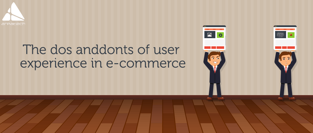
But a good user experience has everything to do with a good design. Let’s visualize what the user expects from an e-commerce site and how we can limit our line of action to certain do’s and don’ts. Let’s take a look.
It’s a universal fact that all visitors are impatient and slow loading times can be death blow to an otherwise well-design e-commerce website. Preferably, the website should not have too many landing pages and their loading time should not be more than a few seconds. So while designing and coding for the web-pages, page load duration should be kept in mind.
Most e-commerce web layouts get misleading when they fail to maintain a uniform page structure. When a visitor is navigating between pages, a uniform page layout will not let them get lost in design. For instance, use a similar header and side menu to be displayed on all pages. It keeps the users focused and they don’t have to worry about the change of design as they go deeper into website.
When e-stores maintain and display products in elaborate categories, it creates better search options for visitors. It’s frustrating for a customer to type a search query and receive “nothing found” as a response. The user does not have much patience to keep typing new phrases to get a response. They will not wait to understand how the system of the website works.
Too many ads on an e-commerce site is not going to help. In fact, over-crowding of ads will overshadow the actual content. An online shopper has a far less attention span and excessive ads will affect page load times and presents information that they are not looking for. Hence, ads should be kept to a minimum number on e-commerce sites.
As a general practice, most visitors like to scan through a website before visiting a particular page. They wish to observe the e-commerce site and get an idea about the web layout by checking the visual cues such as pictures, headings, CTAs and general content placement. If a website has a complicated design, it will take longer for visitors to have a quick look.
First off, an ecommerce site needs to limit the number of Call-to-actions that can be displayed in one page. also, if the site has unrelated content and lacks visual hierarchy, then it will end up confusing the visitor. A page with CTA should limit flashy images and other distracting headings or irrelevant pop-ups. When several things compete for user’s attention, chances are they will end up skipping the CTA you intended them to land up on.
Marketers can produce the most lyrical description for a product but if it’s missing the face, then all you are doing is making empty claims. As an online shopper, I have had a fair share of bad images or incorrect images for various product listings in various online stores. Never under-estimate the power of quality images in e-commerce, for they can certainly make or break your deal.
Before we begin, please solve this quick math check to confirm you're human, and you'll be all set to start chatting with our AI assistant.
Stay connected with us to receive the latest information, updates, and insights from our world of innovation.
By entering your email address you will receive promotional updates.


© 2026 ARPATECH (ADVANCED RESEARCH PROJECTS & TECHNOLOGY)